
Why I Hate The New Google Logo
I don’t like the new Google logo. In fact, I hate it. In all honest truth, I don’t exactly know why I have a “gut” reaction that is pointing to a big NO, but I do.
Maybe it’s the artist in me, rearing its snobbish head and giving this logo a solid thumbs down. Or maybe it’s the schoolroom design which brings back too many unwanted memories of my life as a teacher that ruins the new logo for me – pointing out the obvious fact that ultimately, all design is subjective.
Whatever the reasons, I simply don’t like the new Google logo.
Granted, as a full-time webmaster I have always had a hate/love relation with the big G, but while I might complain about Google’s rankings and endless algorithm switch ups, I never doubted they have some of the best designers and engineers on the planet working for them. Besides, love them or hate them – for me over the years, Google has always represented not only great style but it was my ultimate pick for all things classy online.
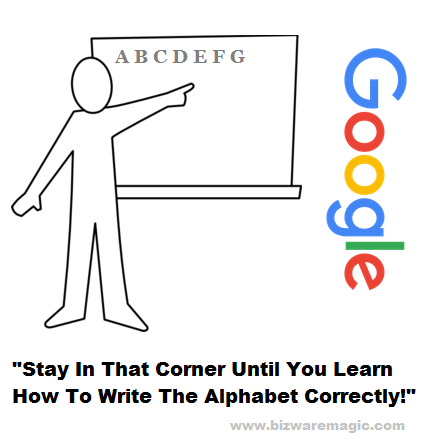
This new logo doesn’t have any class or style – its design is more suited for the kitchen fridge than on the most prominent search engine on the web. The letters/design is too plain, too clear and too childlike. In my opinion, it simply doesn’t work. It is the New Coke times 10000000000000000000000000000000000000000000000000000000000000000000000000000000000000000000000000000!
From a marketing perspective, surely a company the size of Google must have done some split testing of this new logo and the results must have been positive? Surely this test market must have liked this new logo rather than the old ones for Google to use it? But what do I know, maybe there is a genius master plan playing out here – could Google now be aiming their marketing at toddlers – grab their attention while they are still in nappies & you will have them for life strategy.
Over the years, Google has changed its logo many times. Eight times in fact if you count the first Backrub image of Larry Page’s hand and the initial Google logos from 1997 and 1998. While I sometimes found it strange Google should even want to change a proven successful design – why fix what is not broken. But I have liked all the other altered logo designs with the previous logo – the one used from September 19, 2013 to August 31, 2015 – being my favorite.
At least none of them provoked a “gut level dislike” every time I looked at it. And that’s the real issue here while this new logo is not turning me off completely from using Google – it is making the experience of using Google products somewhat distasteful. Nothing major, just a nagging itch or bug, which you would so like to flick away or avoid if you can.
Regardless, my “user experience” is strongly pointing to the downside when it comes to this new design. Probably over-reaching here a bit but has Google symbolically “jumped the shark” with this recent logo change? Forget the Alphabet, if you start ticking off your core audience, it’s game over – even for the mighty G.
Actually, my dislike of Google’s new logo was so strong; I couldn’t believe I would be the only one finding it inferior to bear the mighty Google brand. Glad to say I am not alone on this issue, after some googling I found this rather informative article that examines this problem at great length. It’s on the New Yorker website (a place that I am sometimes told has lots of style and/or class) and is written by Sarah Larson.
Now when anyone questions my dislike of the new Google logo I simply say: It’s Like What She Said!
Titus Hoskins
www.bizwaremagic.com